Orca - Orcallator Graph Information

This document describes the information the orcallator.se tool measures on Solaris hosts. With each description of a particular measurement is an example of some data. At Yahoo!/GeoCities I have observed almost every measurement that exhibits problems to show up somewhere on the site. I have pulled these particular pieces of data for this page for illustration purposes.

For more information on Orca and orcallator.se, read the following articles:

There are many other sources of information for the following measurements. An excellent starting point is Adrian Cockroft's SunWorld Online Performance Columns. There is also Sun's support system, including Answerbook Online and SunSolve Online. A large number of books have been written on Unix performance and tuning. Two publishers worth checking out are O'Reilly and Prentice Hall.

At the bottom of this page are all the URLs referenced on this page.

This is version 0.26beta1 of this document and this version number is meant to correspond with the version of orcallator.se that has data represented here. This document was initially written by Duncan Lawie and updated by Blair Zajac and is an unfinished piece of work. If you have any additions, suggestions, feedback, corrections, please email them to the Orca discussion mailing list.

Disk Measurement Resources

The disk measurements presented below can be slightly confusing as there are many different types of measurements and it is not always clear what the different system utilities, such as iostat and sar, are measuring. I recommend reading the following articles written by Adrian Cockroft. The orcallator.se tool measures the values according to the concepts in these articles.

Orcallator.se Measured Values

System Overview

System Overview

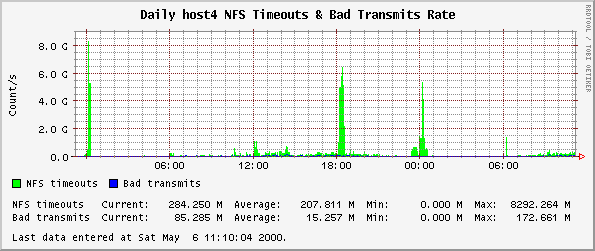
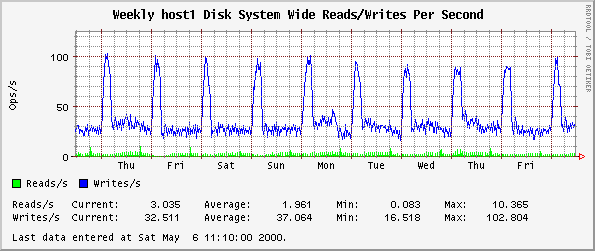
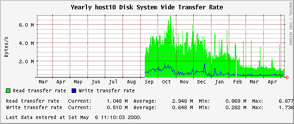
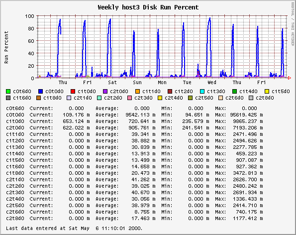
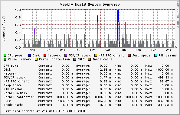
This graph is based on the SE classes that examine 11 different components of a system, such as disks, net, RAM, etc. The SE classes use rules determined from experience to represent the health of that component. This is all described very nicely in an article by Adrian Cockcroft. The rules in this 1995 article do not necessarily reflect the rules in any other SE releases.

The orcallator.se script goes beyond the determination of a state and assigns a numerical value to the state, which is then plotted. The numerical values grow exponentially to represent that as the state get worse, the represented component is in a much worse state than would be represented by a linear progression. The states and their values are:

  • 0 - White state - completely idle, untouched

  • 1 - Blue state - imbalance, idle while other instances of the resource are overloaded

  • 2 - Green state - no problem, normal operating state

  • 4 - Amber state - warning condition

  • 8 - Red state - overloaded or problem detected

  • 16 - Black state - critical problem that may cause processes or the whole system to fail

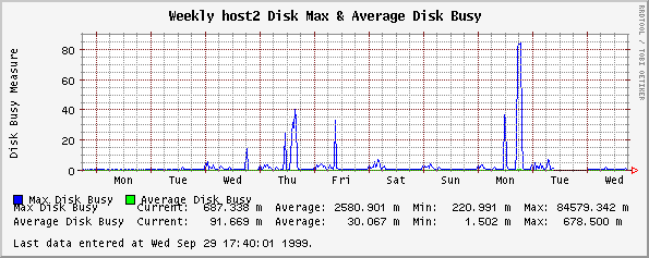
Any values over 1 warrant a look at.

Note: The colors in the plot have nothing to do with the colors representing state.

The values recorded by orcallator.se are twice the values plotted here. After I released orcallator.se I decided that having a component operating in an acceptable state (white, blue or green) resulting in values ranging from 0 to 2 is not natural to system administrators, where system loads above 1 mean the system is busy. The division by two makes this more intuitive.

System Uptime

Average # Processes in Run Queue

This graph shows the system's uptime.

Average # Processes in Run Queue

Average # Processes in Run Queue

This graph plots the average number of jobs in the run queue over the last 1, 5 and 15 minute intervals. On Solaris systems this is how the system load is calculated and are the same values displayed by the w, or uptime commands.

System Load

Older versions of orcallator.se recorded two sets of data, one labeled {1,5,15}runq, and the other {1,5,15}load. Both sets were calculated identically from the same system variables. When I was made aware of this, orcallator.se was changed to only record the {1,5,15}runq values and orcallator.cfg now only makes one plot, not two.

If long term trends indicate increasing figures, more or faster CPUs will eventually be necessary unless load can be displaced. For ideal utilization of your CPU, the maximum value here should be equal to the number of CPUs in the box.

CPU Usage

CPU Usage

This graph shows the percentage of CPU time being consumed by user and system processes, with the remainder making up idle time.

If idle time is always low, check the number of processes in the run queue. More, or faster, CPUs may be necessary. If user CPU time is commonly less than system CPU there may be problems with the system set up.

New Process Spawn Rate

New Process Spawn Rate

When run as root only, orcallator.se can read the kernel to determine the PID of the last created processes. Over the normal 5 minute interval orcallator.se sleeps for 5 seconds and wakes up to query the system how many new processes were spawned and calculates a new process spawn rate for the 5 second interval, and then sleeps for another 5 seconds. At the end of the normal 5 minute sampling interval, orcallator.se stores the maximum observed spawn rate for a 5 second period and the average spawn rate over the 5 minute interval. The 5 second measurement should always be larger than the 5 minute measurement.

While the data may be interesting, I have not found any particular use of this data. If you do, I would be interested in hearing of it.

Number of System & Web Server Processes

Number of System & Web Server Processes

This graph is a simple count of the number of processes currently on the system and the number of web server processes. This includes sleeping, defunct and otherwise inactive processes in addition to runnable processes.

If there seem to be an excessive number of processes on the system related to the run queue, check for defunct processes (ps -ef | grep defunct). The actual amount of work being done is better indicated by the number of processes in the run queue. However, each process on the system will take up system memory.

Number of Web Server Processes

Number of Web Server Processes

This is very similar to the plots made of the Number of System & Web Server Processes plots, except only the number of web server processes are counted. In the default orcallator.cfg file, the number of web server processes data is plotted along with the total number of processes on a system and in a separate plot, just the number of web server processes are plotted. Two distinct plots are created since some hosts do more than just serve pages and the number of web server processes may be a small fraction of the system total.

This plot is useful to determine if your web server is being pushed to its limits. For Apache web servers, the MaxClients setting in the configuration file specifies how many separate apache processes to pre-fork and thus how many simultaneous connections Apache can serve. If you see this plot reach a plateau and never get any higher, then you are likely refusing incoming connections. In this case, examine the TCP Listen Drop Rate plots and look for listen drops. If they are there, then you need to increase MaxClients.

The number of web server processes is determined by counting all the processes that contain the string defined in the WEB_SERVER name passed to the se command. If WEB_SERVER is not defined, then a search is done for "httpd".

Web Server Hit Rate

Web Server Hit Rate

When orcallator.se is instructed to examine a web server access log, it generates two numbers with respect to the number of hits per second. Instead of sleeping the normal 5 minutes between generating system statistics, orcallator.se sleeps for 5 seconds, wakes up and counts the number of new hits appearing in the web server access log, and returns to sleep for another 5 seconds. Over this 5 second interval it calculates a average hits per second statistics. orcallator.se then goes back to sleep. Over a 5 minute interval orcallator.se calculates and stores the maximum hits per second rate measured over the 5 seconds interval and also stores the average hit rate over the entire 5 minute interval. The hit per second rate over 5 seconds will always be larger than the 5 minute average. These two graphs are useful for seeing the peak and average traffic your web server receives.

Web Server File Size

Web Server File Size

Over a single measurement interval, orcallator.se measures the total number of bytes served by reading the access log and counts the number of hits that requested objects in the following ranges:

  • Number of files less than 1 Kbytes.

  • Number of files between 1 and 10 Kbytes.

  • Number of files between 10 and 100 Kbytes.

  • Number of files between 100 Kbytes and 1 Mbyte.

  • Number of files larger than 1 Mbyte.

Web Server Data Transfer Rate

Web Server Data Transfer Rate

When orcallator.se reads the web server access log it calculates the average number of bits served per second. This number does not include overhead in the TCP/IP packet headers and retransmissions.

Web Server HTTP Error Rate

Web Server HTTP Error Rate

This measures the number of requests that resulted in 4XX or 5XX return codes per second.

Interface Bits Per Second

Interface Bits Per Second

This set of graphs shows the number of input and output bits per second on the given interface. It counts all bits from each protocol, including headers.

Interface Packets Per Second

Interface Packets Per Second

This set of graphs shows the number of input and output packets per second on the given interface.

Interface Errors Per Second

Interface Errors Per Second

This set of graphs shows the number input and output Ethernet errors per second on the given interface.

Interface Deferred Packet Rate

Interface Deferred Packet Rate

This is the number of times a transmission was deferred to a future time at the interface level. This slows down the transmission time of a packet.

Interface Collisions

Interface Collisions

If two systems try to transmit at the same time they collide, back off for a randomly generated short delay, then try again. When a shared-bus Ethernet gets busy, contention increases and overall throughput drops off if there are many collisions. Collisions are only detected when the system is trying to transmit.

Interface Nocanput Rate

Interface Nocanput Rate

This counts the number of times a received packet was discarded due to slow processing in the TCP/IP stack and lack of buffering on input. When a TCP/IP packet is discarded, the other system has to time out and retransmit, just as if the packet had been discarded by a congested router. This graph therefore indicates "network" problems which are, in part, a result of insufficient CPU speed or too much traffic.

I have observed non-zero values of this on heavily loaded web servers. On a equally loaded server, I have observed Solaris 2.5.1 to have 2 to 10 times as many nocanputs as Solaris 2.6. There will probably not be as large an improvement to Solaris 2.7.

TCP Bits Per Second

TCP Bits Per Second

The number of bits per second transferred via TCP. This will be generally be less than the sum of transmits for all interfaces which include other protocols and additional low-level overheads, such as the additional bytes for the IP and TCP headers.

TCP Segments Per Second

TCP Segments Per Second

The number of segments per second transferred via TCP.

TCP Retransmission & Duplicate Received Percentage

TCP Retransmission & Duplicate Received Percentage

This plot graphs the percentage of incoming and outgoing bytes that were retransmitted. High values for either of these is an indication of either a congested network dropping packets or long delays. Retransmission occurs when no confirmation of receipt has occurred for the original package and the system has to resend the packet. Duplicate received occurs when another system retransmits and a packet is received more than once.

For sites with large retransmission percentages, such as web sites serving international content, you will probably want to tune your TCP stack using the ndd command. See the Solaris Tunable Parameters Reference Manual and Solaris - Tuning Your TCP Stack page for more information. Look specifically at the TCP retransmission timers.

TCP New Connection Rate

TCP New Connection Rate

The rate at which new TCP connections are created. The Input or Passive Open rate is the rate at which the system is receiving new connections. The Output or Active Open rate is the rate at which the system is actively making new connections to other systems.

TCP Number Open Connections

TCP Number Open Connections

The number of current TCP connections. This includes "long" connections such as ssh/rlogin as well as "short" ones like scp/ftp.

TCP Reset Rate

TCP Reset Rate

This graph shows the rate at which TCP ports are being reset, i.e. connections being refused. A high value here indicates a remote system may be port-scanning or repeatedly attempting to access a closed port.

TCP Attempt Fail Rate

TCP Attempt Fail Rate

This graph shows the rate at which the active TCP connections that the host is attempting are failing to open. This is the value as shown by netstat -s's tcpAttemptFails. You can watch this value grow if you attempt to telnet to a host that you know will not accept the connection:

netstat -s | grep tcpAttemptFails
telnet www.caltech.edu 64321
netstat -s | grep tcpAttemptFails
	     

TCP Listen Drop Rate

TCP Listen Drop Rate

The rate at which new connection attempts have been dropped from the listen queue. This happens when the system is receiving new connection requests faster than it can handle them.

On systems running Apache, this can happen when more people are making connections to your web server than you have Apache configured to handle. In this case, increase the MaxClients value in your Apache configuration file.

Sleeps on Mutex Rate

Sleeps on Mutex Rate

Mutex is mutual exclusion locking of kernel resources. If multiple CPUs try to get the same lock at the same time all but one CPU will sleep. This graph shows the level at which sleeps are occurring.

NFS Server Call Rate

NFS Server Call Rate

This graph plots the rate of NFS calls to this server and the rate of NFS reads and writes services broken down into NFS v2 and v3 reads and writes. The sum of v2reads, v2writes, v3reads and v3writes will be less than nfss_calls as we're not plotting all the other types of NFS calls (getattr, lookup etc).

NFS Server Call Distribution

NFS Server Call Distribution

This graph plots the rate of NFS reads and writes services broken down into NFS v2 and v3 reads and writes. The sum of v2reads, v2writes, v3reads and v3writes will be less than nfss_calls as we're not plotting all the other types of NFS calls (getattr, lookup, etc).

This plot is identical to the previous plot except that the total number of calls is not shown. This is done to show the distribution of calls that may not otherwise be visible.

NFS Client Call Rate  

NFS Client Call Rate

This graph indicates the rate at which NFS calls are being made across the network. A high rate indicates that remote mounted disks are being highly used.

I and others have observed abnormally high, such as 10e9 operations, being reported by orcallator.se. This is an unsolved bug in SE toolkit.

NFS Timeouts & Bad Transmits Rate

NFS Timeouts & Bad Transmits Rate

This graph contains two figures which indicate problems with NFS mounts if values are high.

  • Timeouts occur when NFS requests have not been satisfied within a given time. This results in retransmissions.

  • The Bad Transmits rate is the rate of timeouts which occur with a bad transmission, such as when packets are lost or delayed on the network.

I and others have observed abnormally high, such as 10e9 operations, being reported by orcallator.se. This is an unsolved bug in the SE toolkit.

Disk System Wide Reads/Writes Per Second

Disk System Wide Reads/Writes Per Second

This plot measures the number of read and write operations across all the disks on the system.

Disk System Wide Transfer Rate

Disk System Wide Transfer Rate

This plot measures the average number of bytes read from and written to all the disks on the system per second.

Disk Run Percent

Disk Run Percent

The run percent is measured as the percent of time in a given time interval that the disk is working on a request. This is the iostat %b measurement and is sometimes called the active/run queue utilization or run busy percentage. It varies between 0 and 100%. See the references to read in the disk resources section for more information on this measurement.

This plot displays each disks run percent and can be used to gauge the load imbalance on all of your disks.

There is a known bug with Orca version 0.27 and below that causes it to generate multiple versions of this plot. The problem is due to the way Orca does internal bookkeeping of the different disks it has seen and ends up generating different lists of disks from different source files that are not placed in the same plot.

Disk Maximum & Average Busy

Disk Maximum & Average Busy

This plot is now replaced with the plot displaying each disk's run percent.

This plot shows how busy all of your disks are and how much busier your busiest disk than the average of all the disks on the system. This is used to show an usage imbalance on your disks that may warrant moving some data or partitions around.

The maximum value is the largest run percentage on all the disks on your system and the average is the average of all disks.

Orcallator.se 1.12 and before had a bug in calculating the mean disk busy where it would be too small.

Disk Space Percent Usage

Disk Space Percent Usage

This plot display's the percentage of normally available space that are currently allocated to all files on all locally mounted UFS or VXFS partition excluding partitions mounted under /cdrom. The values displayed are more accurate than those shown by the /bin/df -k since a floating point percentage is stored. Also, the numbers shown are the filesystem usage for non-root users.

There is a known bug with Orca version 0.27 and below that causes it to generate multiple versions of this plot. The problem is due to the way Orca does internal bookkeeping of the different disks it has seen and ends up generating different lists of disks from different source files that are not placed in the same plot.

Disk Inode Percent Usage

Disk Inode Percent Usage

This plot display's the percentage of normally available inodes that are currently allocated to all files on all locally mounted UFS or VXFS partition excluding partitions mounted under /cdrom. The values displayed are more accurate than those shown by the /bin/df -k -o i since a floating point percentage is stored. Also, the numbers shown are the filesystem usage for non-root users.

There is a known bug with Orca version 0.27 and below that causes it to generate multiple versions of this plot. The problem is due to the way Orca does internal bookkeeping of the different disks it has seen and ends up generating different lists of disks from different source files that are not placed in the same plot.

Tape System Wide Reads/Writes Per Second

Tape System Wide Reads/Writes Per Second

This plot measures the number of read and write operations across all the st* tape drives on the system.

Tape System Wide Transfer Rate

Tape System Wide Transfer Rate

This plot measures the average number of bytes read from and written to all the st* tape drives on the system per second.

Tape Run Percent

Tape Run Percent

The run percent is measured as the percent of time in a given time interval that the st* tape drives are working on a request. This is the iostat %b measurement and is sometimes called the active/run queue utilization or run busy percentage. It varies between 0 and 100%.

This plot displays each st* tape drive run percent and can be used to gauge the load imbalance on all of your st* tape drives.

There is a known bug with Orca version 0.27 and below that causes it to generate multiple versions of this plot. The problem is due to the way Orca does internal bookkeeping of the different tape drives it has seen and ends up generating different lists of tape drives from different source files that are not placed in the same plot.

Cache Hit Percentages

Cache Hit Percentages

There are two figures in this graph. The values are percentages showing the proportion of time that data sought is found in the cache.

The Directory Name Lookup Cache(DNLC) which caches file names.

The Inode cache contains full inode information for files, such as file size and datestamps. Low values are likely when find is run on the system. Significant problems are likely to be indicated if inode steals are also occurring.

Cache Reference Rate

Cache Reference Rate

This plot shows how many times per second the Directory Name Lookup Cache (DNLC) and the Inode cache are referenced per second.

Cache Inode Steal Rate

Cache Inode Steal Rate

This plot shows how many times per second the Directory Name Lookup Cache (DNLC) and the Inode cache are referenced per second. Any significant rate of inode steals indicates that the inode cache may not be sufficiently large. This is related to the value of ufs_inode.

Memory Free

Memory Free

This plot shows how many bytes of physical memory are free. This is expected to decrease over time, as pages are not freed until physical memory is full.

Memory Page Scan Rate

Memory Page Scan Rate

This graph indicates the rate at which the system is scanning memory for pages which can be reused. Consistently high rates of scanning (over 200 pages per second) indicate a shortage of memory. Check page usage and page residence times.

Memory Page Residence Time

Memory Page Residence Time

Page residence time is the amount of time that a memory page for a particular process remains in memory. The maximum measured time is 600 seconds. Low values for page residence indicate memory shortages, particularly in combination with high page scan rates.

Memory Available Swap Space

Memory Available Swap Space

This graph shows the amount of swap space currently unused by the system. Memory pages not in active use may be swapped out to allow more active pages to remain in memory. Idle processes will tend to have their memory pages swapped to disk. Running out of swap will stop the system.

Memory Page Usage

Memory Page Usage

Memory pages are defined as in use by the kernel or non-kernel processes. Remaining memory is placed on a free list. This graph shows the number of pages in each. On a quiet system, memory will remain mapped to processes no longer running rather than being returned to the free list. This allows processes to restart more quickly. The free list will, therefore, rarely be more than 3% of memory.

There is currently a bug in recorded information on some systems which suggests that than 4G dedicated to the kernel. This is particularly the case where systems are running Oracle.

Memory Pages Locked & IO

Memory Pages Locked & IO

This is a further breakdown of the "other" section of page usage into use for IO and locked pages.

Reference URLs

These are the URLs referenced through this page.


Orca home page    The Rothschild Image home page    RRDtool home page
Orca 0.265 by
Blair Zajac
blair@orcaware.com
   Funding for Orca provided by the founder of The Rothschild Image, renowned fashion image consultant, Ashley Rothschild.    Graphs made available by RRDtool.

Blair Zajac
Last modified: Tue Feb 4 10:49:44 PST 2003